Code Green

Research
Project Brief
My HCI capstone project, Code Green, is a mobile-based application that aims to revolutionize the grocery shopping and dining experiences for individuals with allergies, dietary restrictions, and specific dietary preferences. During the limited timeline of 11 weeks, we followed a systematic, intensive, and rigorous process throughout the entire product development lifecycle, including research, including literature reviews and user research, ideation, design and prototyping, and testing with users including two rounds of usability testing, reiteration and presentation of the final product.
Project Timeline
Week 1-4
Week 5
Week 6-7
Week 8-9
Week 10-11
Product Concept &
Strategy
Project Proposal
Literature Review
Competitive Analysis
Initial Survey
User Interviews (9)
Affinity Matrix
Personas
User Scenarios
Information Architecture
Mid-fi Prototypes
Interactive Prototypes
Card Sort (Class Activity)
Usability Testing (8)
Design System
Hi-Fi Prototypes
Final Project Presentation
Final Project Report
Challenge
Individuals with dietary restrictions and special dietary needs, including allergies, health conditions, and special diets, often face inconvenience, anxiety, and health risks due to the difficulty in ensuring their food and shopping choices align with their specific requirements. The lack of clear and accessible information, cryptic food labels, and incomplete restaurant menu descriptions exacerbate the challenge, leaving users uncertain about what they can safely consume and requiring meticulous planning to avoid triggers.
Solution
Code Green, a mobile-based application, addresses these challenges on two fronts. Firstly, it serves as a convenient shopping companion, utilizing barcode scanning technology to empower users to make informed decisions by filtering products based on their personalized dietary profiles. Secondly, it streamlines the process of choosing a restaurant by allowing users to filter options according to menu items aligned with their dietary preferences.
Concept Evolution
I was hosting a birthday dinner for my roommate, who is allergic to eggs and follows a Halal diet. Among my two other roommates, one has a life-threatening allergy to sesame and soy, and the other, like me, follows a vegetarian diet. Having no experience shopping with allergies and different diets on the agenda before, it took me a whopping two hours to get through my list. This frustrating experience is the story behind how "Code Green" came to life. Initially, it started as an application that could scan barcodes to identify products to check for any allergies, special diets, health conditions, and other special factors like SNAP, fair trade, etc.,
After conducting our literature review, we realized that we needed to narrow our target users further, especially considering the time frame of the project. With the help of our professor Joseph Wanka, we limited the scope of the project to cater to three user groups: users with allergies, users following special diets, and users that want to avoid certain ingredients (including sub-groups like parents, friends, etc.,). We shelved two other groups: users with health conditions (diabetes, etc.). and users looking for certain foods (SNAP, etc.,).
Origin Story
Defining our Target User Groups
Crafting our UX Strategy
Deciding our Key Features
In order to make Code Green stand out from competitors, we added an additional primary features that allow users to search and discover restaurants based on their dietary profile, by matching their preferences with the items on the menu. While there are apps that have barcode scanning features for grocery shopping, there are currently no apps on the market that have this restaurant search and filter feature, let alone both of them. This makes Code Green an instant and holistic solution for anyone with dietary restrictions, constituting its Unique Value Proposition (USP). Partnering with food industry organizations to access and integrate barcode data APIs would streamline the process of obtaining and maintaining the product database, while detailed information about restaurant menus that includes allergy and dietary restriction information can be provided directly by partnering with the restaurants. The value proposition of Code Green benefits food industry organizations and restaurants, as well as enabling the discovery of their products or bands, by promoting them to users with needs. align with them. This also acts as a revenue stream and creates other opportunities, such as leveraging data analytics, facilitating corporate partnerships, etc.,
We categorized our product features by repurposing the Leader-Filler-Killer framework, popularized by Simon-Kuncher. Our Leaders (akin to the Big Mac or the indefensible coe that compels customers to decide to buy) are barcode scanning to identify and "match" products, searching and discovering restaurants based on "matching" the menu items, profile customization with dietary restrictions and preferences, and SOS in case of severe allergic reactions. Our Fillers (akin to the fries and soft drinks or the enhances that complement without driving the buying decision) create multiple profiles, shopping or favourites lists, and personalized recommendations. Our Killers (the Unwanted Deserts, Coffee, or the potentially off-putting ass-ons) are accessibility considerations like voice input, languages, etc.
We conducted a literature review to understand and contextualize the pain points of our users, as well as validate the motivation and need for the product. It informed our design thinking process by providing a strong foundation for the project and informing the design process by providing valuable data on our target user groups' behaviour, preferences, and challenges.
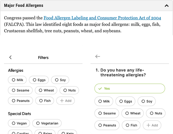
Food allergies are a significant concern in the United States. According to the Centers for Disease Control and Prevention (CDC), an estimated 32 million Americans (approximately 10% of the population) have food allergies. Among these, children represent a substantial portion, with 8% of children affected by food allergies. While special diets like veganism and vegetarianism have seen a substantial rise in popularity, with a 300% increase since 2004, It is estimated that approximately 5% of the U.S. population identifies as vegetarian. In January 2022, Google revealed that searches for "vegan food near me" had dramatically increased in 2021. The term achieved "breakthrough status," meaning it increased by 5,000 per cent or more, indicating the rising popularity of vegan diets.
We organized our information hierarchy based on our research and statistics, ensuring our product services were relevant and aligned with our users' needs.
Literature Review Overview
Additionally, we also researched the human factors basis for our product hypothesis. A few of our key takeaways:
User - Centered Design
Enabling users to create personalised profiles (their specific allergies, dietary restrictions, and preferences) facilitates a user-centric approach, ensuring that the application caters to individual needs and preferences.
Cognitive Load reduction
Simplifying the decision-making process (choosing a product or restaurant based on their dietary profile) for our users by providing instant results immensely reduces the cognitive load by eliminating the need for users to manually analyse ingredient lists. This facilitates the convenience and safety of our users.
Error Prevention
Designing a system that eliminates the likelihood of human error by alerting users to potential allergens and non-compliant ingredients, we help our users prevent errors that could lead to severe allergic reactions or other issues.
Target Users
Anyone with
food Allergies
Anyone with
special diets
Anyone with other
restrictions or preferences
Individuals with food allergies (life-threatening & otherwise) like gluten, soy, nuts, etc.,
Individuals following special diets like halal, vegan, gluten-free, low cholesterol, etc.,
Individuals looking to avoid specific ingredients like GMOs, artificial sweeteners, etc.,
Competitive Analysis
Porter's Five Force
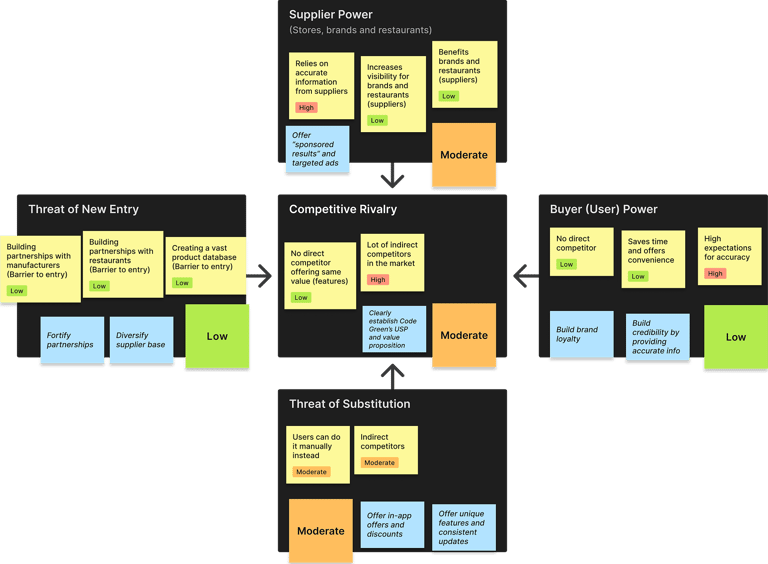
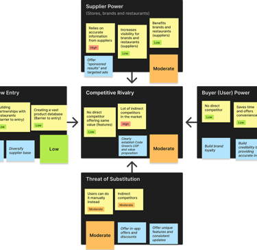
Porter’s Five Forces is a model developed by Michael Porter (Harvard Business School, 1979) that identifies and analyzes the five forces that represent the key sources of competitive pressure within an industry or “The Five Competitive Forces that Shape Strategy”. We employed this model as a means of our competitive analysis to inform and guide our product strategy in order to increase our competitive advantage.
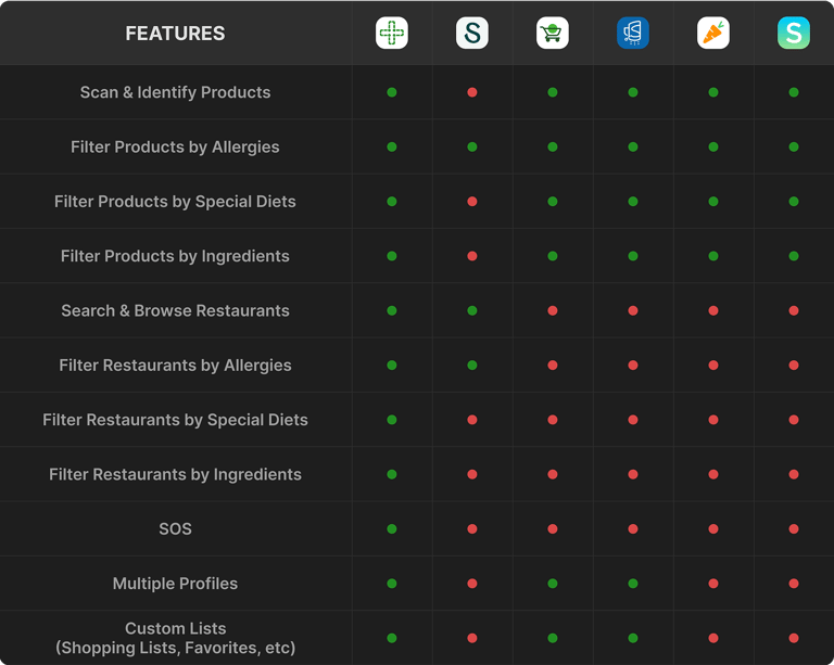
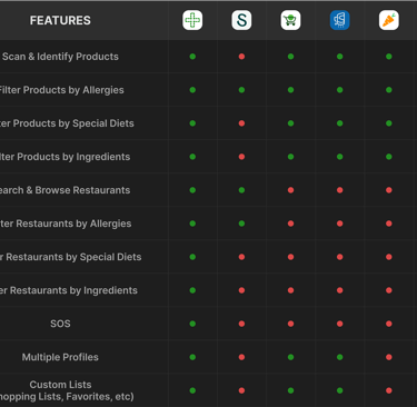
Comparative Future Matrix
We also developed a comparative feature matrix focusing on our direct competitors: Spoonful, Shopwell, Sifter, Yuka and Spokin. Our competitive analysis gave us a lot of insight into how we can differentiate our product from our competitors and address gaps in the market, as well as understanding successful features and best practices as seen in similar applications. Porter’s Five Forces is a model developed by Michael Porter (Harvard Business School, 1979) that identifies and analyzes the five forces that represent the key sources of competitive pressure within an industry or “The Five Competitive Forces that Shape Strategy.” We employed this model as a means of our competitive analysis to inform and guide our product strategy in order to increase our competitive advantage.
Define
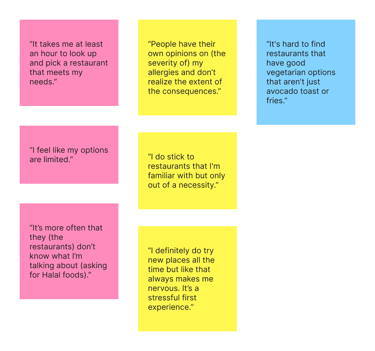
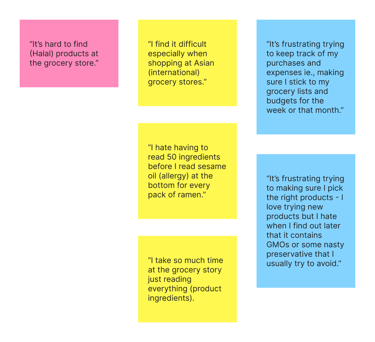
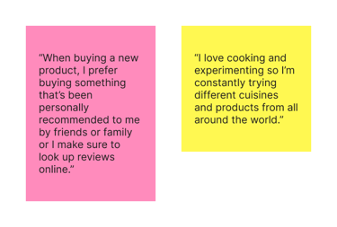


Pain Points (Restaurants)
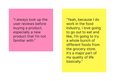
Pain Points (Grocery Shopping)
Motivations (Restaurants)
Motivations (Grocery Shopping)
Affinity Matrix
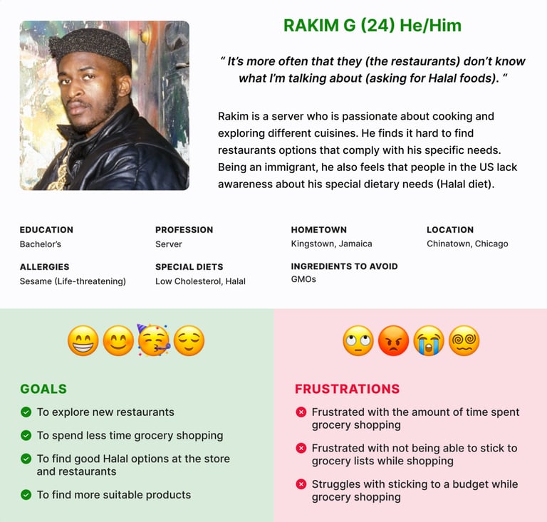
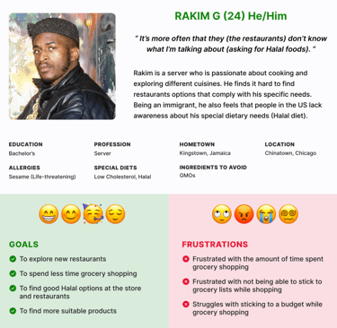
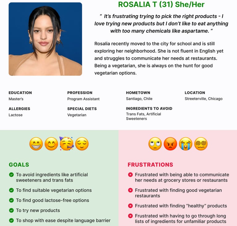
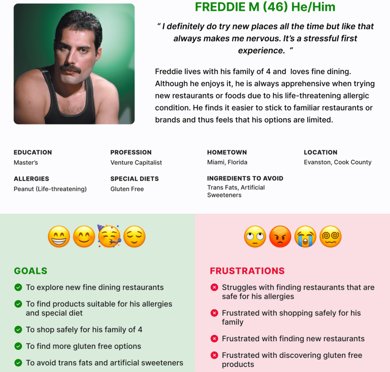
Personas
MVPs for our MVP
For the initial round of usability testing, we strategically defined our goals to ensure that our efforts remain targeted and effective. By limiting the scope of research to the key features to validate with the mid-fi prototypes, the testing process becomes more manageable and actionable. This approach allowed for a more in-depth examination of critical aspects of the usability and core functionality of the product, providing valuable insights that informed further iterations and refinements. Additionally, focusing on the primary features during the initial round of usability testing enabled the team to iterate rapidly and make necessary adjustments early in the development cycle.
For the initial round of usability testing, we strategically defined our goals to ensure that our efforts remain targeted and effective. By limiting the scope of research to the key features to validate with the mid-fi prototypes, the testing process becomes more manageable and actionable. This approach allowed for a more in-depth examination of critical aspects of the usability and core functionality of the product, providing valuable insights that informed further iterations and refinements. Additionally, focusing on the primary features during the initial round of usability testing enabled the team to iterate rapidly and make necessary adjustments early in the development cycle.
Personalization
Healthy and Safety
Convenience
Personalized profile that includes the dietary profile of the user, such as allergies, special diets and other ingredients to avoid
Inventory of products with detailed nutritional information that users can search, browse, or scan barcodes to identify based on ingredients or diets
Search and discover restaurants based on available menu options filtered by ingredients or diets
Ideation
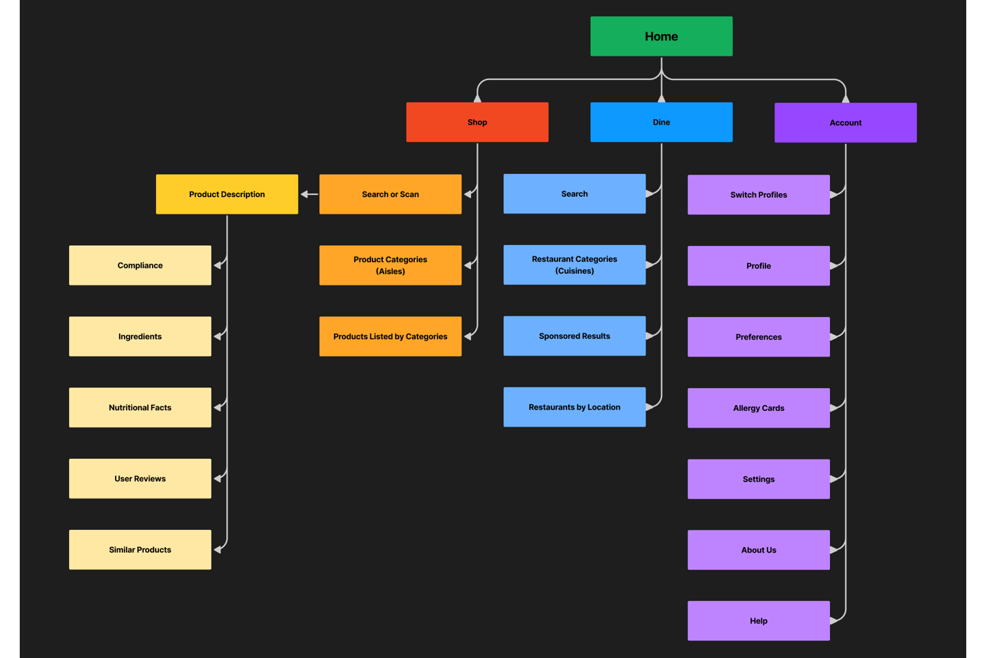
Information Architecture
Mid-Fi Prototype
To optimize efficiency, we streamlined the design process by matching each user scenario to our personas, which also corresponded to the three key features targeted for testing during our usability testing phase. In our usability tests, participants engaged with prototypes while embodying each persona, thereby simulating real-world user interactions within the corresponding user scenarios. This method allowed us to comprehensively evaluate the usability and effectiveness of our designs across diverse user perspectives, ensuring that our solutions resonated with the needs and preferences of our target audience.
Scanning a Product
User Scenario 1 as Rahim( Persona 1)
Persona 1 - Rakim G (24)
Exclude (Allergies): Sesame (Life-threatening)
Diet: Halal, Low Cholesterol
Avoid: GMOs
User Scenario 1
Rakim (Persona 1) forgot to select the “low cholesterol” diet while setting up his profile. He updates the filters and then scans a product at the grocery store to look at the product description
Searching for a Restaurant
User Scenario 2 as Rosalia (Persona 2)
Persona 2: Rosalia T (28)
Exclude (Allergies): Lactose
Diet: Vegetarian
Avoid: Trans Fats, Artificial Sweeteners
User Scenario 2
Rosalia searching for an Ethiopian restaurant to go to with her friend Sharia, who follows a Halal diet
Profile Customization
User Scenario 3 as Freddie (Persona 3)
Persona 3: Freddie M (46)
Exclude (Allergies): Peanut (Life-threatening)
Diet: Gluten Free
Avoid: Trans Fats, Artificial Sweeteners
User Scenario 3
Freddie (Persona 3) sets up his profile and preferences
Design System
MINI DESIGN-SYSTEM
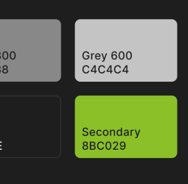
COLORS
The choice of green as the brand colour for code Green is a deliberate and thoughtful decision that aligns with the product name and reinforces its core messaging. Associated with health, wellness, safety, and generally a positive and calming colour, our primary brand colour conveys a sense of health and safety as well as promotes brand recognition through our name-colour combination.

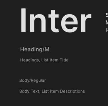
TYPOGRAPHY

GRID
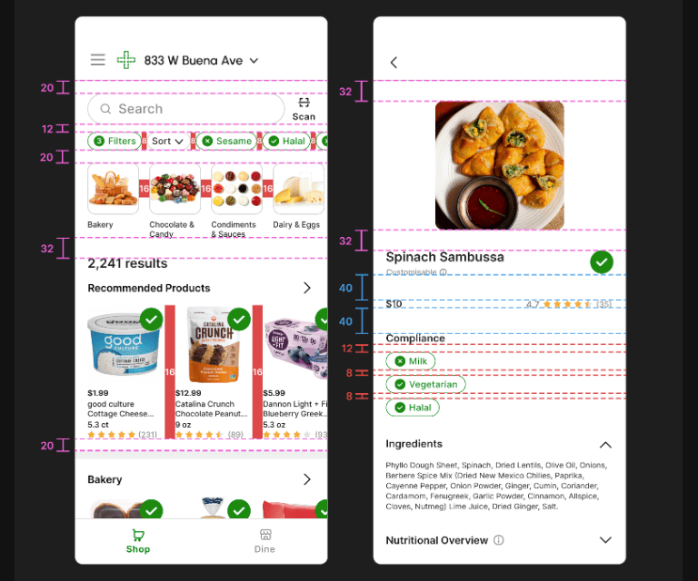
Based on Microsoft's Fluent Design System, our design system follows a base unit of four pixels. The base unit allows a scale of supported sizes. A 4x system reduces confusion while being easy to implement
LAYOUT SPACING
Used in layouts to direct the eye to areas of high importance and guide users to what they need to see next
PATTERN SPACING
Used consistency to create patterns crucial to creating familiar visual rhythm and design cohesion
COMPONENT SPACING
Used consistency to create patterns crucial to creating familiar visual rhythm and design cohesion


ICONS
Examples
Examples
INPUT FIELDS
CHIPS
Examples
BUTTONS
Examples
High-Fidelity Prototypes
HI-FI PROTOTYPES
Scanning a Product
Key Findings
4 out of 8 users were unsure if the filter preferences were updated
2 out of 8 users were unsure if the search results reflected their filter preferences
3 out of 8 users faced difficulty locating the “scan barcode” CTA within the search bar
4 out of 8 users wanted to be notified of the confirmation of updated filter preferences
Recommendations
Changing the “filter” tag and showing the filters selected outside ✅
Highlight “scan barcode” CTA ✅
Display the number of search results ✅
Searching for a Restaurant
Key Findings
User 2 was unable to locate the “Ethiopian” cuisine category
Users 1 and 2 did not notice the toggle for showing “matches only” within the menu section
User 2 intuitively preferred searching via the search bar vs. selecting from the categories shown
User 2 wants to be notified of the confirmation of the updated filter preferences
User 2 wants to see the number of “search results” being displayed (for eg., changes in filter preferences would reflect in the number of search results shown)
Recommendations
Show filters selected outside ✅
Display the number of search results ✅
Add hint for “accommodations available” option ✅
Make “matches only” stand out more ✅
Change “accommodations available” to “customisable” ✅
Profile Customization
Key Findings
Users 1 and 2 completed the task without facing any issues
User 2 wants to see a confirmation page after completion of the task (creation of profile)
Recommendations
Display a “success” screen after completion of task (creation of profile)
Add hints to explain how the preferences work within the app
Additional Feedback
User 1 liked the confirmation screen before creating their profile
Users 1 and 2 found the task simple and straightforward
Recommendations
Add onboarding screens ✅
Testing
STORYBOARDING
After the final week, I came across this TikTok by @mekhischimmel_* that perfectly describes a real-life scenario where Code Green could have come to the rescue. In the video, the user’s friend faces a life-threatening situation due to an oversight by the user while shopping for groceries for the Thanksgiving dinner hosted by them.
This video highlighted a more nuanced but important use case for Code Green: addressing common and statistically unavoidable human errors.
While our product is intended to make grocery shopping easy, less time-consuming and convenient for anyone with special dietary needs, it also eliminates the possibility of human error thereby ensuring the health and safety of our users as well as their friends and family.
*I personally reached out to @mekhischimmel_ and got their consent to feature their TikTok in this case study.
Future Work & Refelctions
FUTURE WORK
While the timeframe of the project has been instrumental in defining our focus and scope to the core features of the application, we recognize the potential for further expansion. While we successfully fulfilled our initial brief of developing and delivering a robust application with the main features of the product, there are other exciting features, additions and aspects for future exploration. Some of these avenues include internationalization (tailoring the application for global users that includes language adaptations, regional preferences and other cultural dietary nuances), integrating emerging technologies (machine learning for personalized recommendations, smart device integration, health monitoring), accessibility features (voice assistance, screen reader compatibility), etc., Some of the additional features we would have liked to have worked on include:
Multiple Profiles
Allowing users to create and manage multiple profiles within a single account. Each profile can represent an individual with unique dietary restrictions, allergies, and preferences. This feature is especially valuable for households with multiple members, each having distinct dietary needs. This helps to further tailor the experience to the specific requirements of each user as well as streamline grocery shopping. Recommendations can be tailored for each profile too.
Cross Contamination Info
Cross-contact and environmental exposure are often cited as top concerns for families managing food allergies. Cross-contact can occur through incidental contact with utilities, pots and pans, and preparation surfaces. Including information regarding the restaurant's practices to minimize cross-contamination, like dedicated preparation areas, staff training, or specific measures taken to ensure food safety. Each menu item can be accompanied by clear labels indicating the presence of allergens or the risk of cross-contamination. The labels are designed with intuitive symbols or color coding for quick identification.
Shopping or Favorites list
Allowing users to create their custom lists, like shopping lists or favourites lists, as well as app-generated ones, will streamline the shopping or dining experience with organized lists. This allows users to save and quickly access their preferred products and facilities planning for special occasions, recipes, etc., Curated restaurant lists can be offered as well, such as "Top 10 Asian Restaurants." or "Highest-Rated Vegan Restaurants," etc.,
Additional Hints
Additional hints, tips, and other educational content related to allergies, diets, and nutrition can be provided to further empower users with a deeper understanding of their dietary needs and options. This adds further value in supporting the users in making informed lifestyle choices and by providing valuable insights, as well as understanding how to utilize and navigate the application better.
REFLECTION
Following an iterative approach was monumental to the success and final outcome of the project. It allowed us to continuously refine and add to the application based on user feedback, feedback from the rest of the class and our professor, as well as evolving requirements. Regular feedback loops ensured that our application was not only meeting technical requirements but was genuinely resonating with its intended audience. Iterative development facilitated flexibility, enabling us to adapt to changing priorities and insights gained during each phase of the project.
Clearly defining our focus and scope for the project was crucial, especially given the limited timeframe. It helped us develop and refine the core features of the application. Identifying our primary objectives and priorities early on helped us manage our limited time and resources effectively. By clearly delineating what fell within the project's boundaries, we ensured that the app's core features were robust, thoroughly tested, and aligned with the intended user experience. The focus and scope were not arbitrary decisions but deeply rooted in user needs. Every feature within the defined scope was a deliberate choice made to address specific pain points of our targeted users.
